Capes & Coffee: How I Combined My Love for Coffee & Superheroes
Superheroes have always held a special place in my heart, a fact that anyone who knows me can attest to. The idea of being a beacon of hope in someone’s darkest hour, the thrill of the action, and the depth of the human side behind every hero are the elements that make the genre so compelling to me. Each hero's flaws, fears, and motivations make them not just relatable but real.
I’ve also always loved a nice, cozy coffeehouse. I spend a lot of time at coffee shops because I love not only a good cup of coffee but also the atmosphere. Coffee houses are perfect for studying, reading, or meeting up with a friend or new business connection. I find a lot of comfort in the sights, sounds, and smells of a coffee shop, and I often find myself being even more productive in those spaces.
When I was brainstorming for new mock projects, I thought about both of these things. I wanted to do something with a superhero theme, but I also wanted to play with a coffee shop. Initially, I was thinking of these ideas as two separate things. Then, eventually, I thought, “What if I combined these two things into one concept?”
And thus, Capes & Coffee was born, a fusion of cozy café culture and bold comic book energy. I ended up creating a concept I fell in love with, and I’m excited to share it with you here!
The Aesthetics & Atmosphere
I wanted to play with blending two very different styles in a way that felt cohesive. A cozy, relaxing coffee house and the typical bold, vibrant comic aesthetic are polar opposite vibes, so I had to find a careful balance where one wouldn’t overpower the other. The challenge was to merge these two aesthetics to make something that felt inviting, yet exciting.
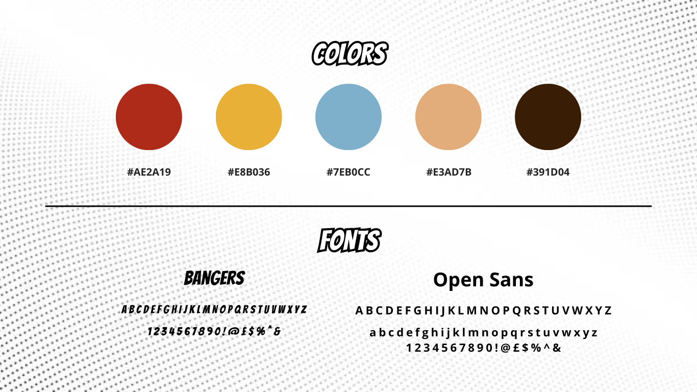
Visually, Capes & Coffee uses halftone texture in its illustrations, signage, and wall art. The brand also sticks to a limited color palette of red, blue, yellow, brown and tan. These colors are applied primarily to graphics, menus, and any artwork lining the walls. I chose this palette because it pays homage to classic comic design while staying cohesive and recognizable, instantly communicating the “heroic” aesthetic without feeling too chaotic or bold.
To match the comic book aesthetic, I chose Bangers, an oversized comic lettering font, for headlines. To balance it out, I paired it with Open Sans, a simple, modern typeface. Bangers adds personality and power to titles, while Open Sans keeps everything grounded and readable.
In terms of interior design, Capes & Coffee uses warm, dimmable lighting to avoid harsh fluorescents. You’ll find dark wood tables, soft textiles, and plush seating to keep the cozy café feel. The seating is arranged to encourage both solitary work and group discussions. The large comic book wall is a focal point where customers can read and purchase comics, adding a unique and engaging element to the space.
The overall goal here was to create a perfect blend of cozy café comfort and comic book creativity. This space feels imaginative while encouraging you to slow down and stay a while. It's comfortable enough to work or chat, but bold enough to spark ideas and capture the fun of classic superhero storytelling.
The Logo Concept
For the logo, I had a lot of initial ideas, but it wasn't easy to narrow down what would work the best. I wanted to create a design that captured both the cozy café and superhero aesthetics without being too busy. I initially thought of using a coffee mug and saucer with a mask, a classic staple of many beloved comic book heroes. However, this design felt a little too busy and didn’t integrate well with the coffee mug. Instead, I chose a cape flowing off the back of the cup, which added enough intrigue to the otherwise simple design without overpowering it. I also added some halftone textures to the cape for subtle shading, adding a touch of comic book energy to the design.
The final design keeps things clean and balanced. The cape adds motion and character, while the mug grounds the logo in the coffeehouse theme. I decided against adding any extra elements because they distracted from the overall shape and clarity of the design.
In the end, this design captured both the cozy café and superhero aesthetics without being too busy. It feels iconic enough to stand alone while still being flexible for use across signage, menus, and merchandise.
The Method Behind the Menu
When I started designing the menu, my goal was to challenge myself creatively. I wanted to see how far I could push my naming and concept development skills while keeping everything cohesive. The menu for Capes & Coffee became a way to explore storytelling through food and drink. Each name needed to feel clever but also natural enough to exist on a real menu.
I played with traits and elements commonly seen in various superhero stories, such as identity, power, space, and energy. I avoided direct character names and trademarked phrases to steer clear of copyright issues, which would be a realistic concern if Capes & Coffee were a real café. However, I made some subtle nods to a few iconic heroes during the naming process.
Below is a look at the specialty items and the reasoning behind each one.
Specialty Drinks:
Secret Identity — Mocha and hazelnut under whipped cream; inspired by the concept of a hero’s alter ego
Midnight Brew — Cold brew with chocolate syrup and oat milk; inspired by Batman and other nocturnal heroes
X-spresso — Double shot espresso with caramel drizzle; a nod to the X-Men
The Sidekick — Half espresso, half milk; inspired by the classic sidekick trope (because every hero deserves a strong sidekick!)
Food Items:
Star-Spangled Scone — Cherry and blueberry scone inspired by Captain America
Hero’s Ham & Cheese — Toasted sandwich with smoked ham and cheddar
Fortress Sandwich — Mozzarella, tomato, and basil on ciabatta
The sandwiches weren’t tied to specific heroes. I included them simply because they felt like something you’d actually find in a cozy café. They were inspired by the kind of meals I like to order when I’m working at my favorite coffee shops. The rest of the menu includes classic café staples, because you can never go wrong with the basics.
Experience & Community
With every business, it’s essential to build community and create a memorable experience. The café would host frequent events to encourage engagement, such as Trivia Tuesdays, cosplay gatherings, and themed drink specials. These types of activities would give customers a reason to come back regularly while connecting with others who share similar interests.
Additionally, Capes & Coffee would have a monthly “Brewsletter,” a recurring update shared through email or social media that highlights upcoming events, new menu items, and community moments from the month. The idea is to build familiarity and connection even beyond the walls of the café, keeping customers involved and excited about what’s next. I wanted Capes & Coffee feel like more than a simple café. It’s meant to be a creative hub for fans, artists, and everyday visitors, a space where community and storytelling come together over a cup of coffee.
Deliverables
For this mock project, I created the logo, a brand style guide, and a loyalty punch card. We’ve taken a look at the logo and style guide, but here’s a closer look at the loyalty card. Many coffee shops have a loyalty program to incentivize repeat visits, and I wanted to experiment with a physical punch card. It felt fitting for Capes & Coffee because it adds a small, collectible element, something tangible that ties into the café’s comic theme. Designing it also allowed me to explore how branding translates into physical marketing materials and customer touchpoints.
Project Takeaways
Creating Capes & Coffee has been one of my favorite mock projects to date. I really enjoyed combining two of my interests and exploring how to merge different aesthetics cohesively. It’s always more enjoyable to design a brand that reflects something personal. Even as a mock concept, this project helped me stretch my creativity and practice brand storytelling in a new context. No matter your experience level, mock projects are a great way to build skills, experiment, and learn. They allow you to take creative risks without external limits, making them one of the best ways to grow as a designer or strategist.
I definitely plan to revisit Capes & Coffee in the future for additional exercises, whether that involves packaging, campaigns, or content mockups. There’s still plenty of room to expand on this concept and refine its storytelling through new touchpoints.
You can learn more about Capes & Coffee and view the full visuals on its project page.


