

Capes & Coffee
I’ve always loved superhero stories and the energy behind them. I’ve also always loved the warm, creative atmosphere of coffee shops. Capes & Coffee started as a fun challenge to see how I could combine both of these concepts into one brand.
Welcome to Capes & Coffee!

Logo
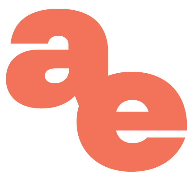
When designing the logo, I knew I wanted to include a coffee cup and saucer to ground the concept in its café roots. My first drafts featured a mug with a superhero mask, but the design felt too cluttered. The final version replaced the mask with a flowing cape, which conveyed the theme clearly without losing simplicity. I added halftone texture to the cape for depth and comic-inspired shading, tying it back to the brand’s visual story.

Brand Style Guide
For the style guide, I wanted to capture the spirit of classic comic book design without overwhelming the cozy atmosphere of a coffee shop. The final palette uses five colors that feel bold and playful while still warm and balanced. Red, yellow, blue, tan, and brown reflect both the comic and café elements in harmony.
The fonts follow that same principle: Bangers for bold, expressive headlines and Open Sans for clean, readable subtext.
The mood board reflects this duality: muted but warm tones, bold textures, and inviting comic & café imagery that merges creativity and comfort.
Menu

The menu was my favorite part of this mock project to create. I wanted each drink and dish to feel like it had a story behind it, inspired by familiar superhero themes like identity, power, and energy. Every name connects back to the world of heroes, but in a way that still feels natural for a real coffeehouse.
To keep the layout professional and consistent, I used the default pricing and structure from the menu template I referenced while building the mockup.
Loyalty Card

Front
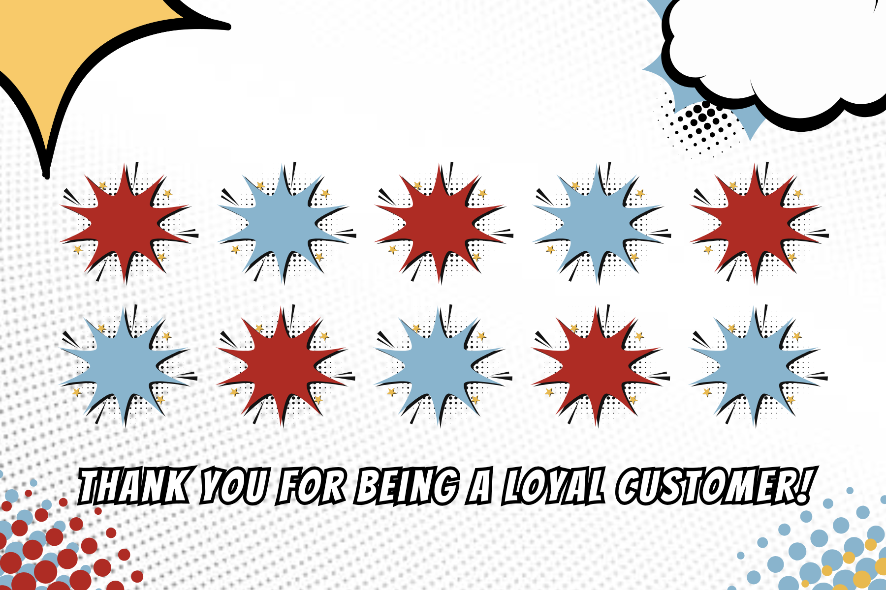
Back
Most coffee shops have a loyalty or rewards program, so I wanted to include one to make the concept feel complete. Designing a physical punch card gave me the chance to think about how branding translates into tangible customer touchpoints. It also adds a collectible, comic-like quality that fits perfectly with the theme. The card serves as both a functional marketing piece and a small extension of the Capes & Coffee story.